Monday, February 28, 2011
Sunday, February 27, 2011
Monday, February 21, 2011
Biggie Smalls
Here is a link to the song that I am basing some of my research on. I went through and selected a few of the lyrics to make into mottos for my bills. I couldn't quite use all of the rules in the manual. The ones I chose are sort of abstract versions of a few of them.
http://www.youtube.com/watch?v=6ihPOTDxMfE
http://www.youtube.com/watch?v=6ihPOTDxMfE
Money Up Date 2-21-11
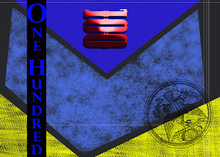
These are two of my layouts that I have gotten to a more finished point. I have been thinking about maybe having negative space on the print itself. Just a box or other shape cut out of one of the section of the bills that. I think it will bring unity between the front and the back of the bill.
Monday, February 14, 2011
Light altering class work
For this in class exercise I had a bit of fun experimenting with the way brush storks in Ps effected the photographs we were given to work with.
This first one became an attempt at a day for night sort of set up. At first I focused on balancing some of the tones in the background, then I thought it would be interesting to attempt and make the scene a night scene. Looking at it as a thumbnail though the highlights seem unnatural for a night scene.
This image was a bit interesting when I first approached it with curves, it seemed to be a bit muddy. Overall this image was fun to alter, the colors were difficult to figure out though. The brushes are a bit to get used too.
This image was a fun. First the sky and the foreground were very opposing contrasts one overpowering the other. I had some fun with this one though and included what is supposed to be a flying object in the background. We have all wondered about the aliens at one point or another, so I figured why not.
FInally here is yellowstone. I don't know how successful this one is, but I did enjoy getting to tackle a valley sort of landscape. the development and overall product were satisfying.
Currency Project
The next assignment in class is to create 12 designs for currency.
Whenever denomination for currency are made they have to be functional. I will stick with denominators that are applicable to the things one would buy presently. I will design plans (front and back) for five of the denominations- ones, fives, tens, twenties, twenty fives. Then I will make a front and back design for a one hundred dollar bill. As for format I will deviate from the longer rectangular layout to a more square-ish pose. Also as a slogan for the bills instead of dead languages or mottos that most are not too agreeable, I will include a few of the ten crack commandments by biggie smalls. I think they are quite applicable here. I have included in this post four examples of bills that I will reference while making these bills.
Saturday, January 29, 2011
10 basic designs
These are ten designs that I have completed using the information we during the first class. This was my first venture into the world of photoshop- and so the results were pretty interesting.
After some layering and playing with a few different brush settings I got the rubber duck to breath fire (Kinda.)
With this design I focused on experimenting with the brushstrokes and the flexibility of digital layering.
Here I found a back ground image and added two rubber ducks.
This was by far the piece that was the most process based design that I came up with.
I layered a few brush strokes and added some filters to create the overall composition.
Here I looked at adjusting the sizes of the brush storks to create a sort of distorted feel to the image. It sort of reminded me of depth of field in photography.
This was probably one of my favorite ones to make. I enjoy the process of painting and studying the results. So when I use a program like photoshop its great the the pigments are free and hypothetically never ending. So it gives me the ability to discover new brushstrokes.
This design was a return to the background that had intrigued me. I enjoy paper-cutting so it was fun to get to experiment with the way that the photo reacted.
This was a departure from the work above, I found the ability to build up layers digitally allowed for different approaches to the image than what I am used to.
This design was an interesting study with moving preexisting images and building up a sort of expressive context for them to exist in.
This final design was a fun throw back for myself and some friends. A logo for a film production company that used to exist among me and my friends in high school.
Subscribe to:
Posts (Atom)


